Products Trends


Wellness and colours | by Luisa Pianzola
The bathroom is becoming an increasingly important living space, taking on the same moods, atmospheres, lighting and finishes as the rest of the home. In this uniform environment combining intimacy and socialisation, the use of intense, bright colours has become crucial for achieving multisensorial – and consequently also visual and tactile – comfort. As a result, interior design trends in this room devoted to personal care are moving away from the idea of an aseptic and sparsely furnished functional space separate from the rest of the home, the concept of the bathroom as a cold white space with a hospital-like ambience of shiny taps, glossy tiles and harsh lighting that in the past made it distinctly unappealing.
Feel-good colours…
Today’s bathrooms, whatever their size, are designed to be places where one can relax at leisure, feel pampered and establish an intimate, emotional and almost therapeutic relationship with the space. So while total white continues to be popular in the bathroom as in the rest of the home, we are seeing a growing trend towards warm, soft, desaturated earth tones containing magentas, oranges, blues, greens and browns for bathroom surfaces. But these tones are chosen not just for their aesthetics: the real reason why the colours of our living spaces enhance the feeling of comfort is that our bodies actually need them, absorbing them through our eyes, retina and brain. The primary colours red, blue and yellow or their complementary colours green, orange and violet are particularly important, even if they are present in small percentages and mixed with more neutral tones. It’s hardly a coincidence that these are the colours that have always been chosen for colour therapy in wellness systems.
… And to reduce the intrusion of technology
Alongside physiological aspects regarding the use of colour in wellness spaces, further considerations include ethnic and cultural contaminations such as references to vintage atmospheres, fashion, nature and sustainability. One characteristic shared by all coloured surfaces, whether ceramic, metal, glass, wood or other solid materials, is a soft touch matt finish. As for the most technical items such as washbasins, WCs, baths, shower trays and taps, choosing a colour that blends in with the rest of the room avoids unsightly clashes with the other furnishings while creating a continuum of colours.
Goodbye to glossy chrome
The latest trends in the world of taps are moving away from the traditional glossy chrome finish. Matt black is becoming popular, as are burnished copper, brass and bronze offerings amongst users who are reluctant to abandon a metal finish. Brushed stainless steel is a timeless solution that always retains plenty of tactile and visual appeal. Classy and modern, it works best with a minimalist and innovative design.
Glossy finishes that evoke a sense of coldness and slipperiness (a disastrous choice for the bathroom!) should be strictly avoided.
- 01.
- 02.
- 03.
- 04.
- 05.
- 06.
- 07.
- 08.
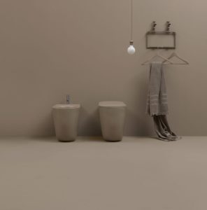
01. The NoLita collection WCs designed by Alessandro Paolelli for Kerasan are available in wall-hung and floor-mounted versions. The rimless WC reduces water consumption, while the version with adjustable outlet is ideal for the most complex renovation projects as it can be connected to the existing fittings without the need for building work. The series, which includes washbasins and accessories, comes in glossy or matt white, black, burgundy, hazel and ash colours.
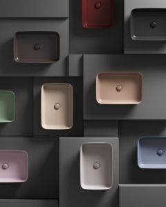
02. Inspired by the work of 16th century French ceramicist Bernard de Palissy, the Ipalyss series designed by Robin Lavien for Ideal Standard is made from the new Diamantec ceramic material ideal for the production of thin yet strong and elegant designer washbasins.
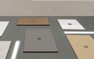
03. The Docciatre collection shower trays designed by CreativeLab+ for Ceramica Globo are just 3 cm high but strong and safe. The secret lies in the new glaze which is applied uniformly prior to firing and contains special non-slip Waterpaste grip. The colour palette includes matt and glossy White, Agata, Perla and Castagno.
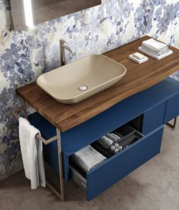
04. The compositions of Mobilduenne washbasin units stand out for their bold colours coordinated with wood. Version 713 (pictured), in a matt Blu Fes colour, features a solid Canaletto walnut top, matt beige ceramic countertop washbasin and metal accessories.
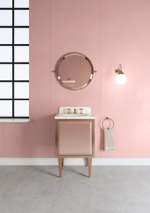
05. Inspired by the Bauhaus period in America, the Him and Her collection of vanity units with a metal structure from Devon & Devon stands out for its delicate colours and small size (width of just 57 cm) ideal for small bathrooms.
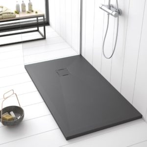
06. The Breccia series shower trays from Lacus are made from marble powder, calcium carbonate, quartz and resin. With a textured, non-slip and gel coat coloured surface and a thickness of 3 cm, they are available in white and anthracite colours.
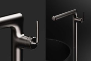
07. Allen, designed by Odo Fioravanti Design Studio for Alpi, is a collection of taps with a meticulous rational design inspired by the high-precision look of mechanical instruments, the linear forms and rounded joints combining effectively with the soft finishes.
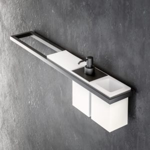
08. Cubic+ is a collection of accessories from Progetto that stand out for their brass structure and special matt black finish, complemented by modular solid surface containers. The entire series, from the toothbrush holder to the dispenser and soap dish, is made in Italy and meets all requirements of practicality and comfort.
October 2019


